UK Hackathon Landing Page
Built for my study abroad class
I wanted to make a hackathon website for my study abroad class. I had good intentions to finish it before the course began and managed to build an MVP — but the result was so underwhelming that I was immediately unimpressed and abandoned it.
You can still view that original version here:
https://uk-hackathon.vercel.app/
Three months after the course ended, I came back to the idea. I wanted to work on a UI project and kept thinking about that website. This time, I wanted to do it right — starting with a complete design in Figma and then translating those changes into the frontend. My goal was to move quickly, turning designs into working applications without getting stuck in the process.
First Design and Early Thoughts
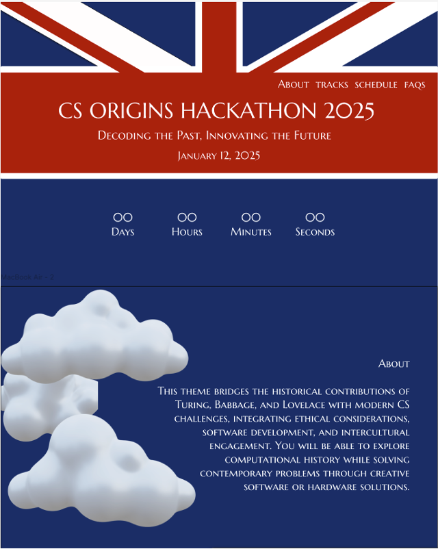
Looking at the initial design, a few issues stood out immediately:
- The site felt very flat.
- The navy blue theme made the page feel gloomy.
- I wanted to keep some cloud elements, but I needed a better transition — possibly using a gray background that blends with the clouds.
- I also wanted to incorporate a more “light royalty” theme, drawing on ideas like afternoon tea, rather than making the design feel dreary.
- I envisioned cute animations when a user clicked on one of the tracks, and I wanted the UI to feel more personalized per track.
- I considered adding subtle motion — something like the bobbing animation used on Stanford’s website.
- The clouds needed to be reworked.
- A moving progress bar for the schedule also seemed like a nice interactive detail to add.
Sourcing Visuals: A Surprisingly Long Detour
I didn’t want to draw clouds from scratch, so I started searching for good, free, high-quality, transparent-background clipart. This process turned out to be much harder than expected.
I looked in a lot of places:
- Figma files: There were only a few with clouds, and it was frustrating to open separate files just to extract one image at a time.
- Canva: It has a great clipart library and editing tools, but it doesn’t let you download images with a transparent background unless you have a premium subscription.
- KTTL (via a YouTube video): This tool generated AI art, which seemed promising, but I ran into the same background issue.
- Pexels: Mostly full photos, not illustrations or clipart.
- IconScout: Had icons with transparent backgrounds, which I was willing to use if needed.
- Freepik: A lot of nice images, but most didn’t have transparent backgrounds. I experimented with using them as wallpaper-style backdrops, but the effect didn’t work — especially since I wanted animated elements layered on top.
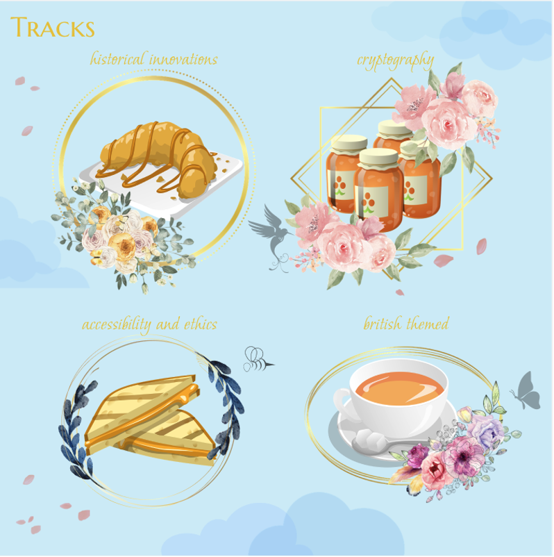
- Pixabay: This is where I finally found what I was looking for — a solid collection of transparent-background images with a cohesive style.
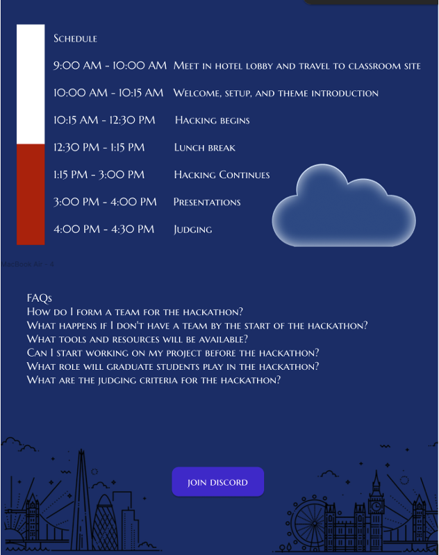
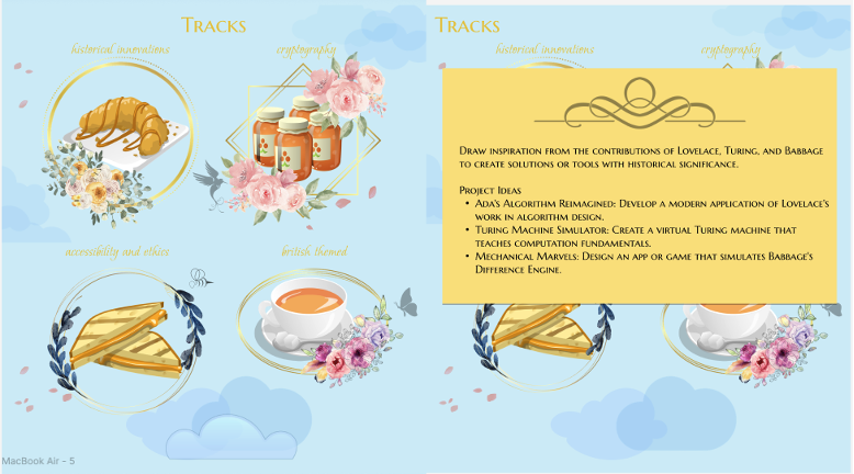
Most of the current images on the “Tracks” section come from Pixabay. I’m still a bit concerned about maintaining a consistent art style throughout the rest of the site, but I’ll work through it as I go. Design is harder than it looks — especially when you want it to be thematic and interactive.
Also, I found out you can remove the background on images, but alas, it was too late and I had already picked out a few good images by then.
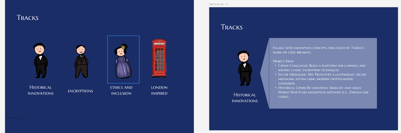
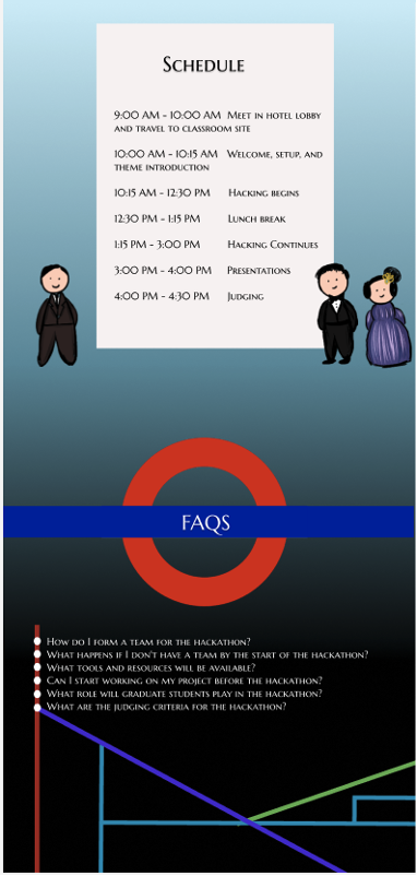
This was iteration 2:
Translating Design to Code
Eventually, I started coding the site in React. I used ChatGPT to help with many pieces along the way. For animations, I incorporated Framer Motion, which I used to animate the cloud bounce effect.
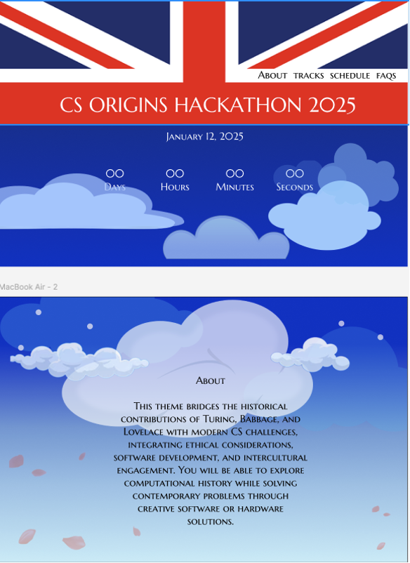
I initially wanted to have the clouds form a UK flag in the background, but stretching any image to that size completely ruined the quality. My only other option would have been to create the flag from scratch, which wasn’t worth the time, so I decided to focus on a simpler “About” page instead.
At this point, it felt like I had spent a lot of time just trying to perfect the look of the site. I attempted a few more animation ideas, but the result looked overly simple and not well-executed. I decided to stop designing and just finish building the actual website. Designing turned out to be much more difficult than I had expected.
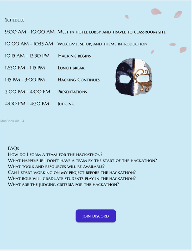
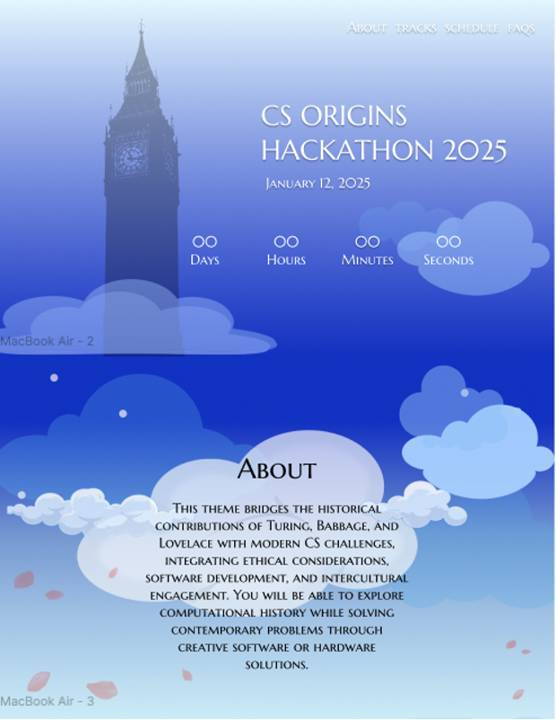
So this ended up being my final iteration of design:
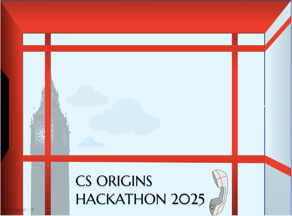
I wanted to add a telephone booth animation to get onto the landing page, but it simply didn’t look as good and would take too long so I decided not do it.
Final Design
- Latest Figma file: https://www.figma.com/community/file/1497671567576185053/hackathon-website
- Final site: https://study-abroad-omega.vercel.app/
- GitHub repository: https://github.com/suchitahadimani/study_abroad
There are still things I want to improve, but I’ve learned a lot through the process — both about visual consistency and the process of tranlating design to functional website.